Click on the PORTFOLIO folder to see what we have done

Sunday, July 26, 2009

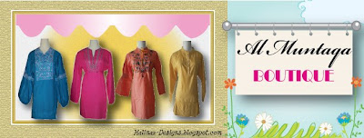
Banner for Al-Muntaqa Boutique


Al Muntaqa Boutique is an on-line store which sells modest blouses and tunics. Their collection are colourful with cute details like buttons and some has intricate embroidery and beading.

The Concept:
I created the header as if people are looking at the display window of Al Muntaqa Boutique. The blouses are so colourful that I just put a plain white with yellow background at the back. The "walls" are given a "brick and mortar" look with a banner hanging outside the shop. Looks very welcoming doesn't it?

Let's go visit Al Muntaqa Boutique here

Banner for Aimi Fickry

I recently did a banner for Aimi, who runs a personal blog. She writes mostly about her family and their activities. She loves pink, so she requested for a header with pink background.

Here is her banner:


The Concept:

Aimi is such a family person. As such, I created a header which has photos of her and her loved ones. I made it to look like they are portraits on the wall with a brown geometric border. Flowers adorn the border to add "sweetness" to the overall image.

Check out Aimi's blog here

Sunday, July 19, 2009

Blogging Tips: Free Vs Custom-made Templates

There are many websites offering free blog templates, so why should one spend money for a custom made one?

Here are some reasons:
(1) Be unique
Free template means anybody can download and install it as their own blog. The result? Your blog could have the same look as another person's. Worse if you are doing business on your blog and your competitor has a same look! Could cause confusion among your customers.

(2) Show you mean BUSINESS
If you intend to use your blog to showcase your products or services, or as an e-shop, using a free template shows that you are not putting much effort into your business. It is just like opening a shop and just let the construction worker do the basic design for your interiors. How would that make you look to your customers? By having a custom-made template, it shows your customers that you are serious in your business.

(3) Be significant
Have you ever visited a blog and say "Whoa! Great blog. I must bookmark this one"? They say "content is King", but a good-looking king would attract more visitors, don't you think? Being on the internet with millions of other blogs, you need to make yourself standout from others. By having a custom made template done based on who YOU are and what you stand for, you will definitely attract more visitors to your blog.
Friday, July 17, 2009

Banner for Our Mini Store

Sis Liz from OurMiniStore.blogspot.com requested a unique header for her e-shop to make it special. Above is the header for her blog. She is using a free blogger template which while cute, really has a "generic" look to it. The new header shows off the uniqueness of her e-shop, just as she wanted.

The Concept:
Sis Liz sells authentic branded handbags. As such, I wanted to have a "classy" look for her header yet highlight the gorgeous products that she offers. Therefore, I took images of her products and created a "cut-out" look and place them on a "display rack" as if it is in a real boutique. The glowing effect gives is an added polished look.

Colours are kept to a minimum to highlight the colours of the products on the rack.

Check out the blog "live" here

Wednesday, July 15, 2009

ALIMKids Hijab

My latest design job was for Norita who is doing ALIMKids Hijab for girls.


I did the header design and added a linkbar below the header on her blog. The blog template was originally "Thisaway Rose" by blogger.com. I changed the header with my design and changed the background to plain white as requested by Norita.

The Concept:
The header was designed to show off the various hijab styles available. The background was done in blue "denim" texture to give it a "hip" and "teen" feel as the hijabs are meant for pre-teens and teens. The white background for the tagline is made to look like lace trimmings to give a feminine feel to the "masculine-ness" of the denim texture.

To see the blog "live" click here

Friday, July 10, 2009

UmmikuSayang Membership Program

Top: The Outer Page

Below: The Inner Page
This brochure cum Membership Form was done as part of UmmikuSayang's Privilege Card program where members of the card are entitled to special privileges.

The Concept:
The idea behind the Privilege Card was as a way to reward the customers for their loyalty. It is also a way to show the company's love to the customers by giving them discounts and privileges for being a member. In return, the customers can show their love to their loved ones by purchasing Islamic items (at members discount) to enhance their spiritual understanding.

The Outer Page
The "cover" page shows the privilege card being hung on a heart-shaped outline. This is in line with the theme of "A Gift of Love"

The outer page also shows the website (www.UmmikuSayang.com) which shows how the customers can easily order on-line or join the on-line community via the website.

The Inner Page
Consists of the membership form on the right and information about the privileges (nicely done as the "A, B, C"s). On the top right (which is where the eyes will focus on first), is an image of a mother and her children, clearly showing the love between them. The words next to the image acknowledges about the important roles that mothers do and how being a member can benefit them.

Ummiku Sayang Activity & Books Centre 2-fold Brochure

Top: The outer page

Top: The inner page


This was a 2-fold brochure to market UmmikuSayang Activity & Books Centre in USJ.


The Concept:
The outer page:
When folded, the first page that people see is the "Welcome to..." page which welcomes them into UmmikuSayang. When they flip it open the next layer will be the page with the four boxes which invites them to be part of UmmikuSayang's programs : as a card member, sales agent, dealer or affiliate. Next they will find the centre spread which is also the inner part of the brochure.

The middle part of the outer brochure provides some background information about the company and the map to the place.

The inner page:
Centre spread concept where all the products and activities unfold before their eyes. Note that the photos on top of the pink background are products and the green background are activities.

It is easier to explain to potential customers what products and activities are available through pictures rather than words, hence the use of more photos than writing in the centre spread.


UmmikuSayang's Affiliate Banner


This 200x200px banner was done for the UmmikuSayang Affiliate program and is also used by UmmikuSayang to advertise their on-line shop (www.UmmikuSayang.com) .


The Concept:
The purpose of the banner is to get people to click it. Therefore we have a photo of a young happy girl, with the caption inviting people to her favourite shop. The girl in hijab was purposely chosen because the bookshop is an Islamic bookshop.

The background consists of the actual bookcases in the shop. There is an oval 3-D button with the word "enter" which catches the attention and attracts people want to click the "enter" button.

Note that there is no mention of UmmikuSayang in the banner as we want people to click the banner to find out more.

A sample of the banner is available at UmmikuSayang's Activity blog here

ALIMKids Bookshop Banner

This is the header for ALIMKids Bookshop blog (AlimKidsBookshop.blogspot.com).

The Concept:
The background is done in pink and green, which are the corporate colours for the company. Since the main purpose of the blog is to highlight the books and activities at the shop, I put the address and contact number right in the header so it wouldn't be missed.

I put the photos of the actual bookcases and activities at the shop in the banner to entice people to visit the shop. The photos are the same as the flyers and bunting done for the shop to provide consistency in design.

To see the header, visit ALIMKids Bookshop's blog here.

ALIMKids Banner


This banner was done originally as a header ALIMKids Playgroup's blog (AlimkidsPlaygroup.blogspot.com). Now it's used also on ALIMKids website - www.Alimkids.com.

The Concept:
Since it was designed for the playgroup, I included photos of two playgroup children. This one was selected because they are both wearing ALIMKids tshirts and look so cute in their masks. The cloud above is to complement the "clubhouse" on the left and make it look as if they are playing outdoors.

See the header on ALIMKids Main Website here and the playgroup's blog here